Fan Club: A New KVS Theme for Creator Platforms and Premium Content
We are excited to introduce Fan Club — a new ready-made theme for Kernel Video Sharing (KVS), created for projects focused on creators and…


Your cart is empty
Your cart is empty
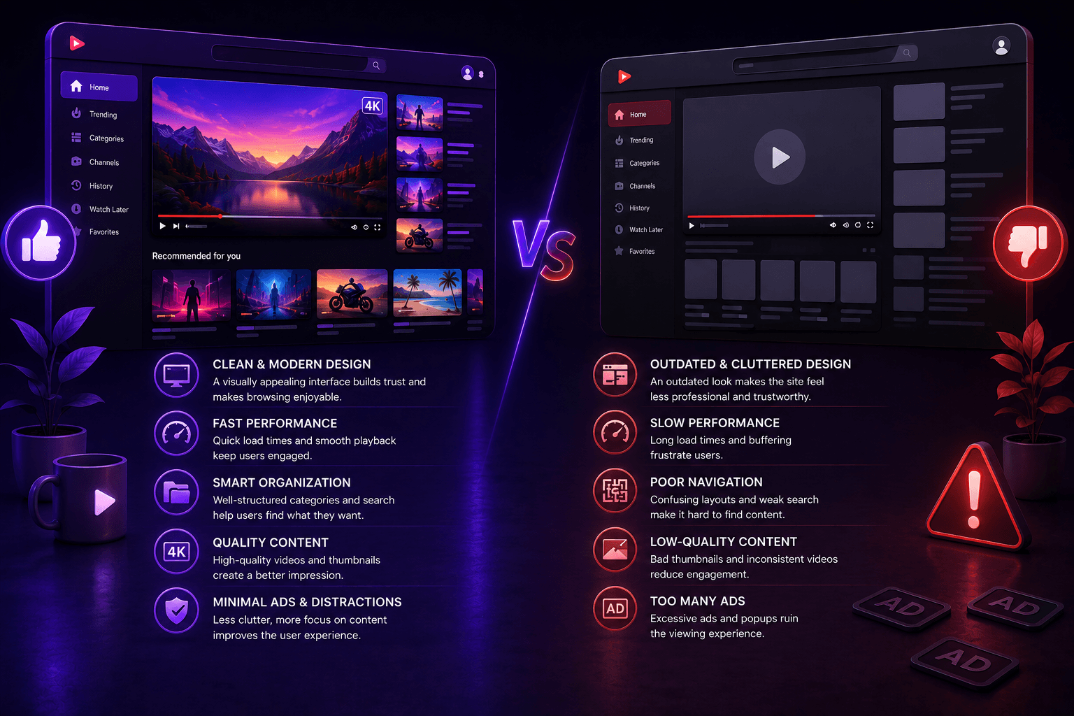
You’ve probably experienced this before: you open one website and within just a few seconds it already feels comfortable to use. The content is easy to find, the navigation feels natural, nothing feels distracting, and the entire interaction simply flows.
And then there’s the opposite experience. A site may have modern visuals, plenty of content, and a large number of features, but somehow using it still feels frustrating. Navigation feels awkward, elements compete for attention, and the interface creates a sense of overload.
What’s interesting is that most users cannot clearly explain why one site feels better than another. Usually, they experience it intuitively.
In reality, the difference rarely comes down to the number of features or visual style alone. Most of the time, it’s the result of dozens of smaller decisions that together shape the overall user experience.
In this article, we’ll look at why some tube sites feel more polished, engaging, and natural to use than others.
Most users don’t evaluate a website the way designers or developers do.
They don’t think about HTML structure, UI systems, or layout logic. A user simply opens the site and almost instantly decides whether it feels comfortable or not.
That’s why the perception of a website is built around many small details:
When all these elements work together, the site starts to feel “right.”
Today, most users interact with tube sites from mobile devices.
This changes the way people consume content and dramatically increases the importance of interface behavior.
A website that feels comfortable on desktop may still create friction on mobile if:
Good mobile UX is not just about responsive design.
It’s about reducing unnecessary effort.
Users should be able to:
This is one of the reasons why some tube sites instantly feel smoother and more modern than others.
Another important detail is that users rarely evaluate actual technical performance.
Instead, they react to how fast the website feels.
Two sites may have similar loading times, but users can still perceive one of them as significantly faster.
This usually happens because of smaller UX decisions:
A technically fast site can still feel slow if the interface creates hesitation.
On the other hand, a well-structured platform often feels faster simply because interaction flows naturally.
This psychological perception of speed has a huge impact on user comfort.
Another important detail is that users rarely think about how a site is technically built. Instead, they react to how quickly the platform responds to their actions.
Even a visually modern site can feel slow or uncomfortable if users constantly need to stop and think about what to do next.
This is why interaction speed is often more important than visual complexity.
When users move naturally from one action to another, the site starts feeling smoother and more intuitive overall.
At the same time, overloaded interfaces often create the opposite effect. Too many elements competing for attention can make navigation feel heavier than it actually is.
Good tube sites usually avoid this problem by keeping the interaction flow simple and predictable.
One of the most common mistakes is trying to add as many blocks, buttons, and interface elements as possible.
In reality, users rarely visit a tube site to explore the interface itself. Their goal is usually simple: quickly find interesting content and start interacting with it.
That’s why good tube sites often feel simpler.
Not because they have fewer features, but because:
The less time users spend trying to “understand the site,” the more comfortable the experience becomes.
Navigation is one of the most underestimated parts of user experience.
Many site owners focus heavily on homepage visuals or player customization, while users are actually paying attention to how easily they can move through the platform.
A website starts feeling more professional when users always understand where they are, what they can do next, and how to continue exploring content without friction.
This is why strong navigation systems often have a bigger impact on retention than individual design elements.
A huge part of the user experience depends on how naturally users move through the site.
Even strong content can feel worse if:
On the other hand, when the structure is thoughtfully organized, users naturally spend more time on the platform.
This is one of the reasons why some projects feel more “alive” and engaging than others.
Another important factor is balance.
Advertising is a normal part of most tube platforms, but there is a major difference between integrating ads into the experience and allowing ads to completely dominate it.
Users usually tolerate monetization when:
Problems begin when the website constantly fights for the user’s attention.
Aggressive popups, excessive redirects, overloaded banners, and intrusive elements create friction that users instantly notice.
Even if the site contains strong content, poor interaction flow can make the entire platform feel low quality.
This is one of the reasons why some projects feel more professional despite having a simpler design.
The experience feels controlled rather than chaotic.
Very often, the feeling of convenience is not created by major design decisions, but by smaller interface details.
For example:
Each individual element may seem minor on its own.
But when all of them work together, users begin interacting with the platform much more naturally and effortlessly.
That’s why some sites feel “faster” or “smoother” to use, even when technically they perform at a similar level.
Content structure affects far more than simple organization.
It directly influences how users consume content and how long they remain engaged with the platform.
When categories, tags, related videos, and search systems work together naturally, users move through the website almost automatically.
This creates a smoother browsing experience and increases the chances that users continue interacting with the platform for longer sessions.
Most visitors rarely open just one video and leave immediately.
Usually, interaction develops into a sequence of actions:
If the structure supports this behavior naturally, the platform becomes easier and more enjoyable to use.
That’s why strong tube sites are built not only around content itself, but around the way users explore it.
One detail that users rarely notice consciously is interface consistency.
When buttons behave differently on different pages, filters work inconsistently, or navigation changes unexpectedly, the platform starts feeling unstable.
Good tube sites usually maintain consistent interaction patterns throughout the entire project.
For example:
This consistency reduces cognitive load.
Users stop thinking about the interface itself and focus entirely on content consumption.
That feeling of “effortless browsing” is often one of the strongest indicators of good UX.
An interesting detail is that even websites built on the exact same theme can feel completely different.
That’s because overall perception depends not only on the design itself, but also on:
This is one of the reasons why customization eventually becomes an important part of project growth.
As a site evolves, new challenges appear, user behavior changes, and the interface needs to adapt.
One of the biggest differences between average and highly engaging tube sites is how easily users discover additional content.
Strong platforms rarely rely only on a homepage or search bar.
Instead, they create multiple natural paths for content discovery:
This creates a continuous interaction loop.
Users no longer consume just one piece of content — they continue exploring the platform naturally.
The easier this process feels, the stronger the overall retention becomes.
This is why many successful projects invest heavily in navigation structure and recommendation logic over time.
One of the clearest signs of good UX is that users barely notice it.
They don’t stop to think about buttons, layouts, or navigation systems because everything feels intuitive from the beginning.
This creates a sense of comfort that is difficult to measure technically, but extremely noticeable in practice.
Good tube sites reduce hesitation.
Users don’t need to constantly figure out where to click next or how the platform works. Interaction becomes almost automatic, making the overall experience feel smoother and more enjoyable.
When the interface feels natural:
As a result, the platform starts feeling higher quality overall, even if users cannot fully explain why.
The difference between an “average” tube site and one that genuinely feels enjoyable to use rarely comes down to a single big feature.
Most of the time, it’s built through dozens of smaller decisions:
These are the elements that shape the overall feeling of quality.
In the end, users may not remember specific features or interface elements, but they will remember how comfortable and natural the site felt to use.